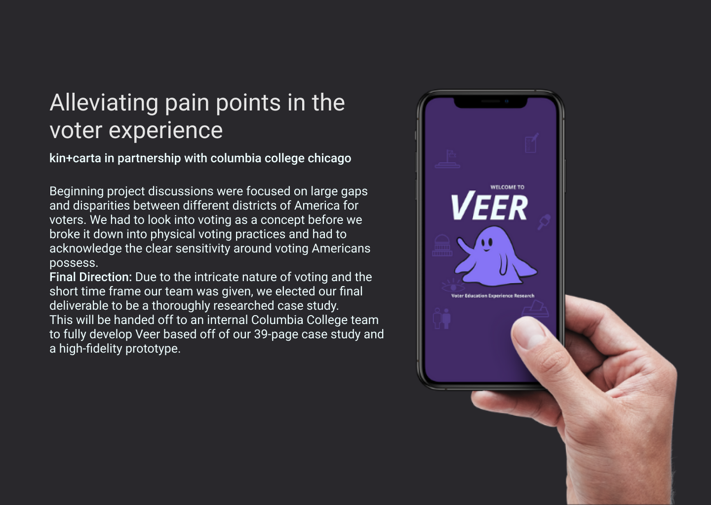
Defining the problem with empathy mapping
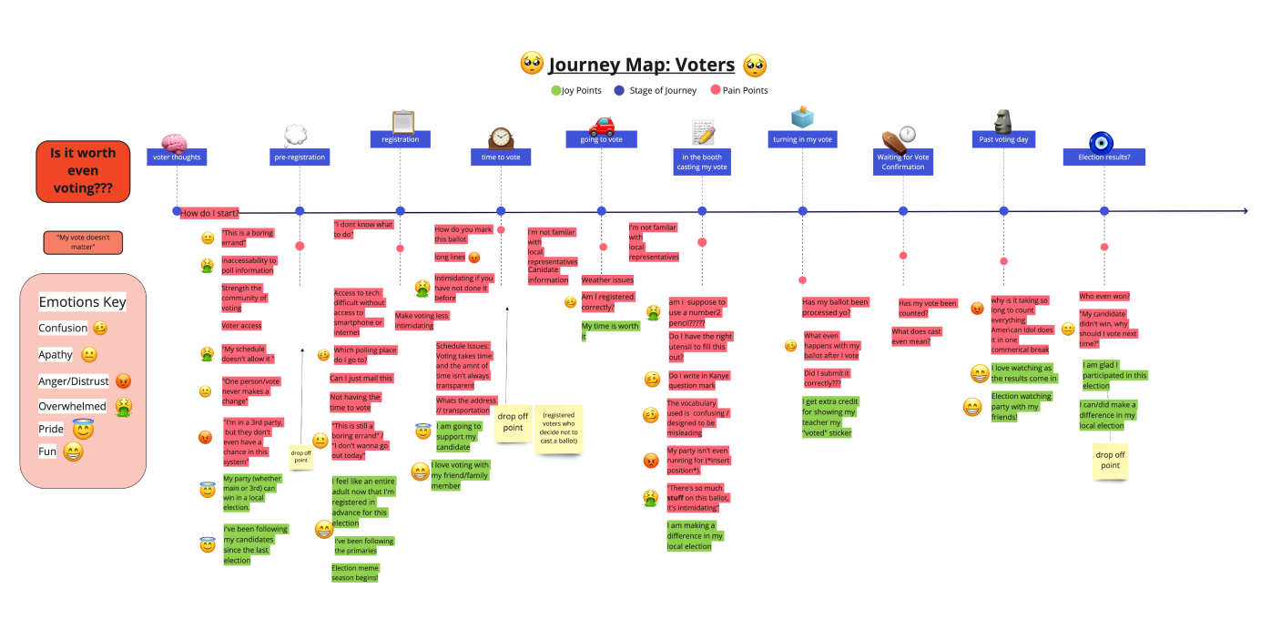
We created an empathy map that describes emotions experienced through the voting journey. We used red to show pain points and green for points of joy. Click here to view pdf.
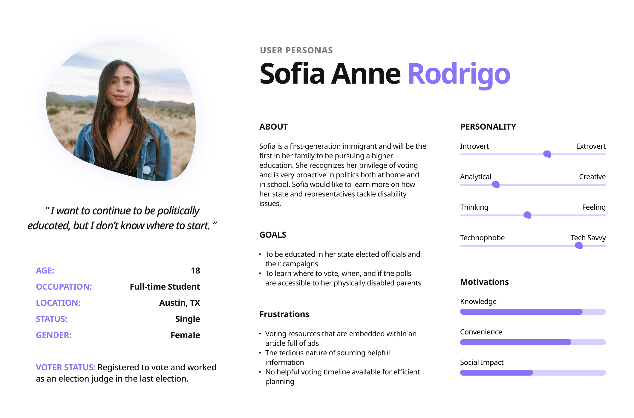
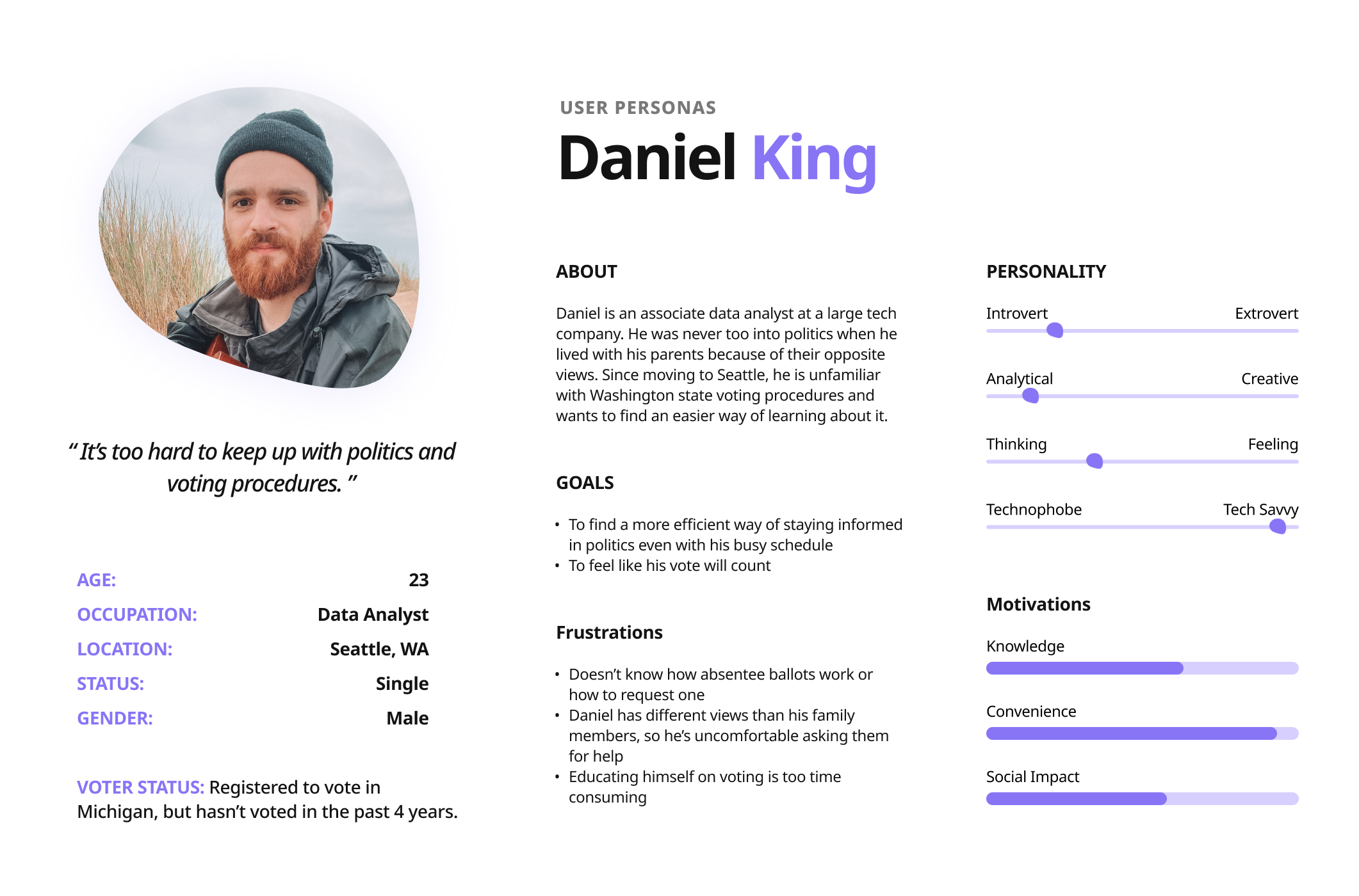
Personas
VEER’s specific user personas capture what our research found to be the primary and secondary personas that would find our service the most rewarding. By predicting their motivations, needs, and pain points, we are then able to corporate the user’s expectations of usability into the interface.
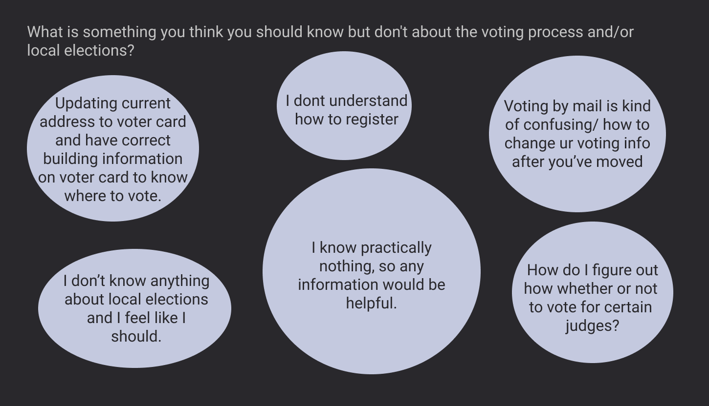
User research: education preferences
The survey captured the responses of 15-to 20-year-olds across the nation. In total, we received 46 responses across 6 different states.
The responses were recorded through Google Forums. Participants were sourced directly from our team through two universities and social media.
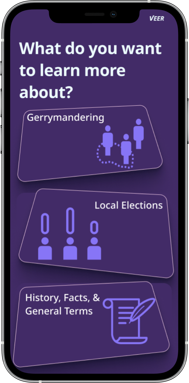
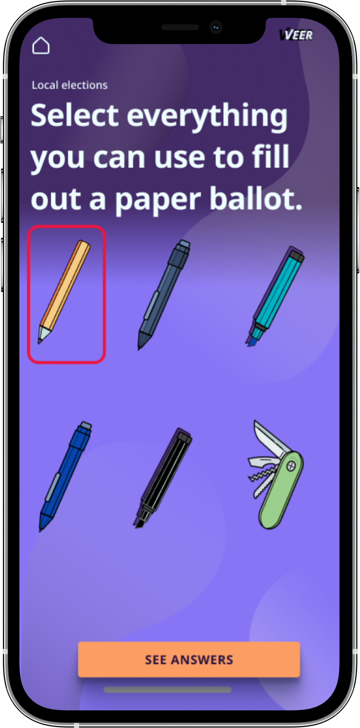
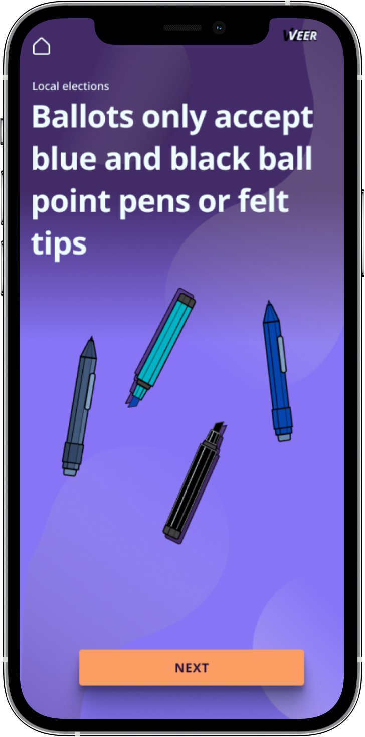
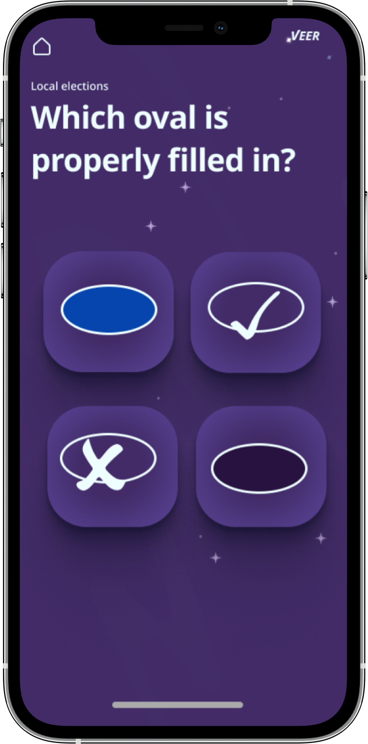
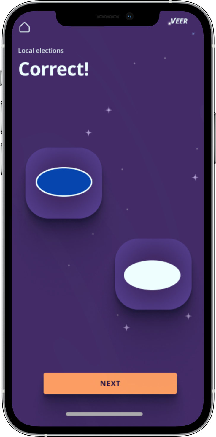
Survey goal: find the biggest voting knowedgle gaps for our personas to create learning paths for our interface. We made the choice to build out one path journey because of time limitations. The 2nd and 3rd paths will be featured in our final prototype. A future internal team will finish the paths.


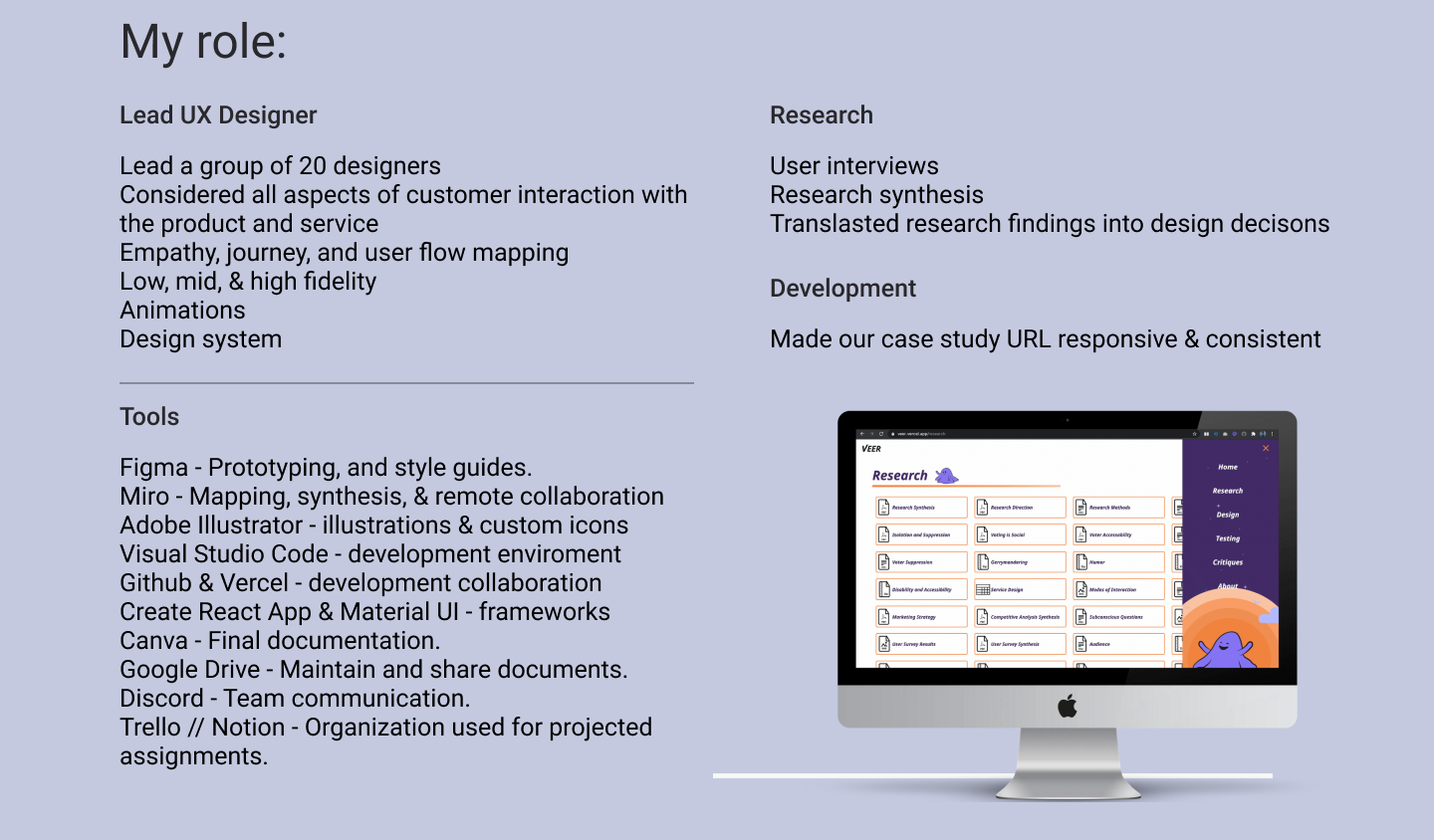
At this phase in the project, design, content, and research were working streamline. We chose to establish information flow so the content team could have the ability to begin UX writing. At the same time, my design team began lo-fi prototypes. View the information flowchat a few people from content and I created here.

We developed a user flow chart to gain a better understanding of the sort of conversational interface we planned to create and lay the foundation for what would later become our prototype. The focus was on what specific content should be presented, how that content should be arranged and ordered, and overall how these decisions might affect the user experience. We asked ourselves questions like, “In what ways does the user progress, do they get quizzed? What mediums of content will be included? What is the most important topic to present first?”. View the chart here.

User testing color preferences: We conducted color testing to discover what scheme our target audience preferred. Our test was conducted based on one of Nielsen Norman Group's methods of testing visual stimuli. Utilizing 5-Second Testing on our participants allows us to capture the “gut reaction” of the color palette that they are viewing. The final results provide us with a narrowed selection of palettes to choose from on top of adjectives that best align with our service.
Read more about our color user test here.
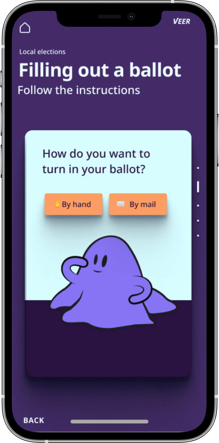
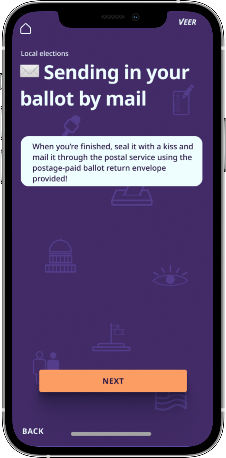
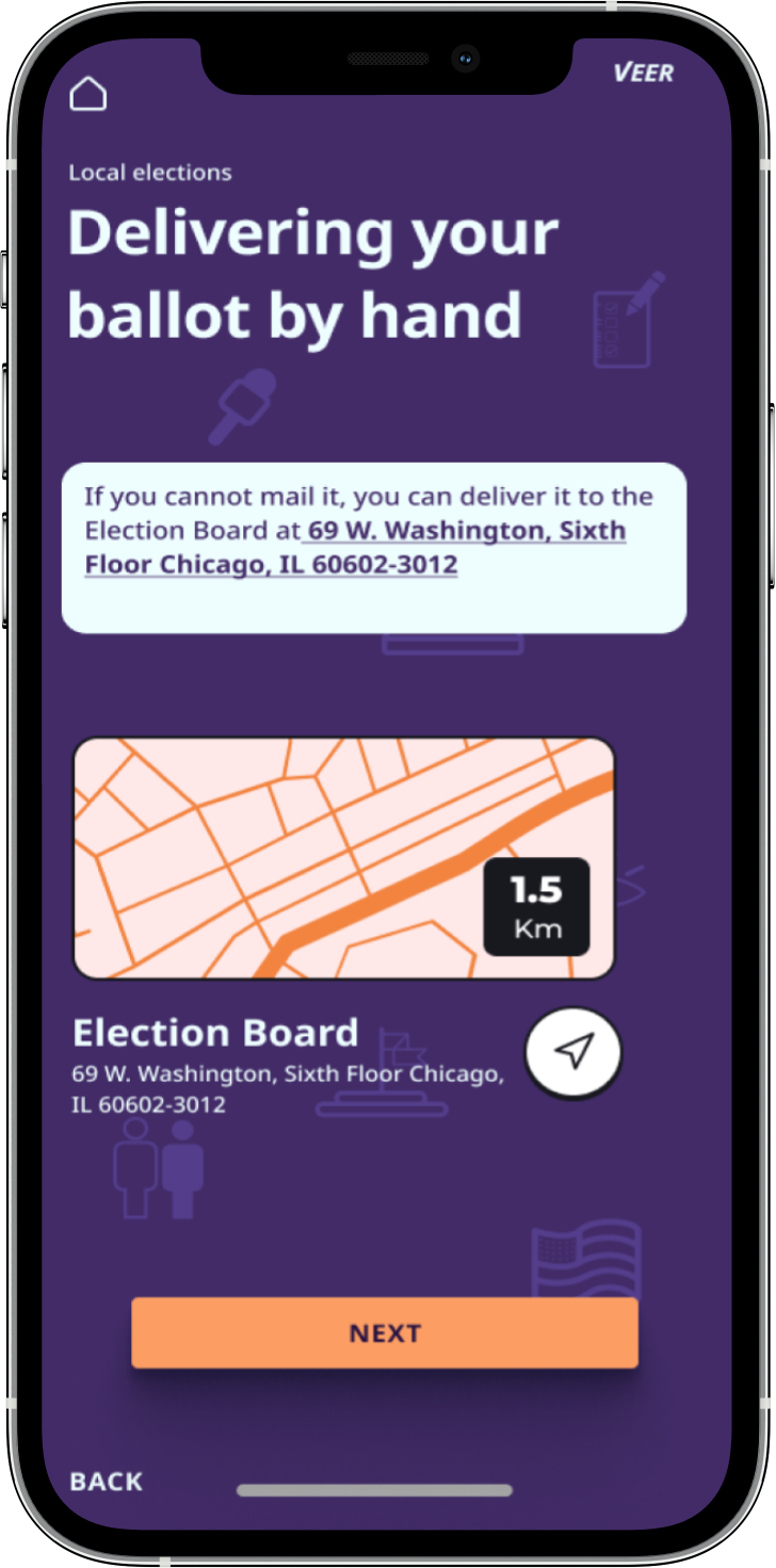
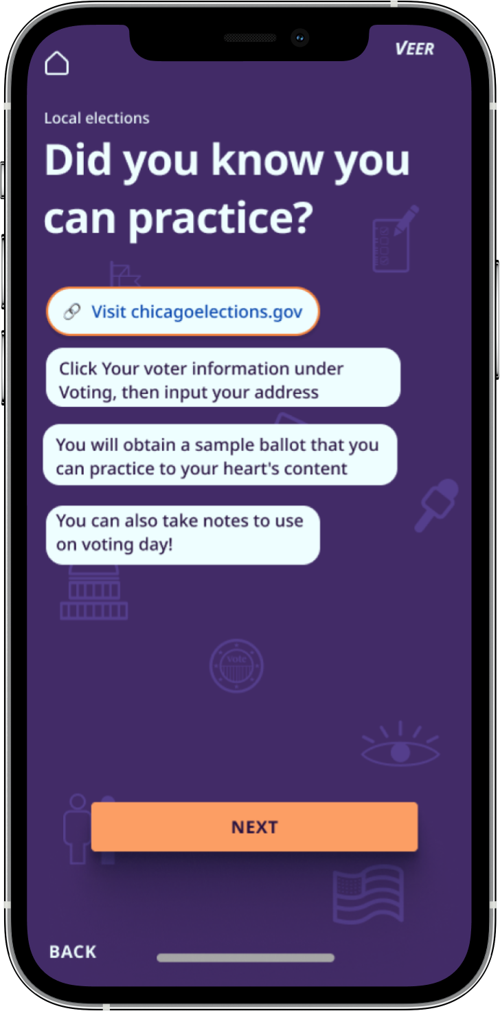
Clickable prototype

Problem-solving: 3 weeks before our final client meeting, we completed our mid-fi prototype. During an internal meeting, we realized the accessibility testing was done incorrectly by our color testing team. I ran testing and implemented the now AAA color scheme immediately.
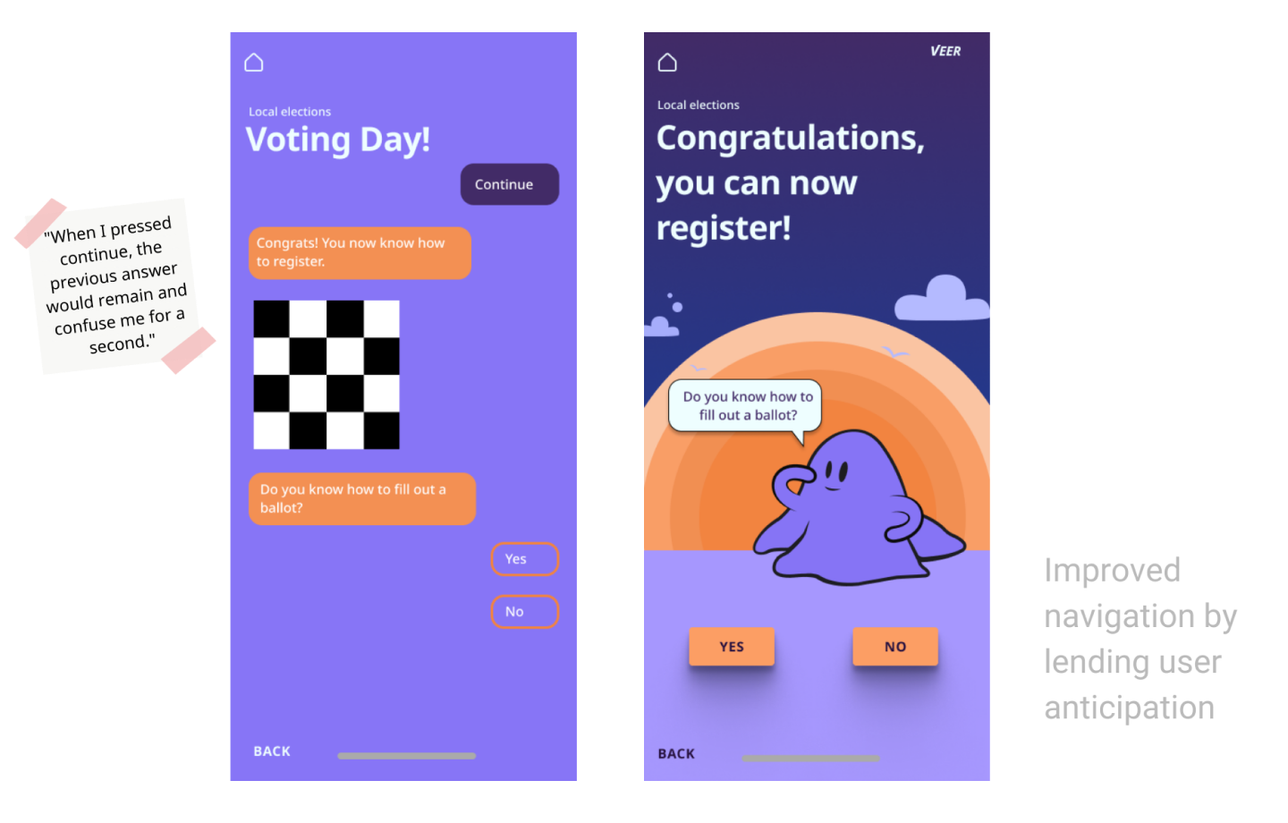
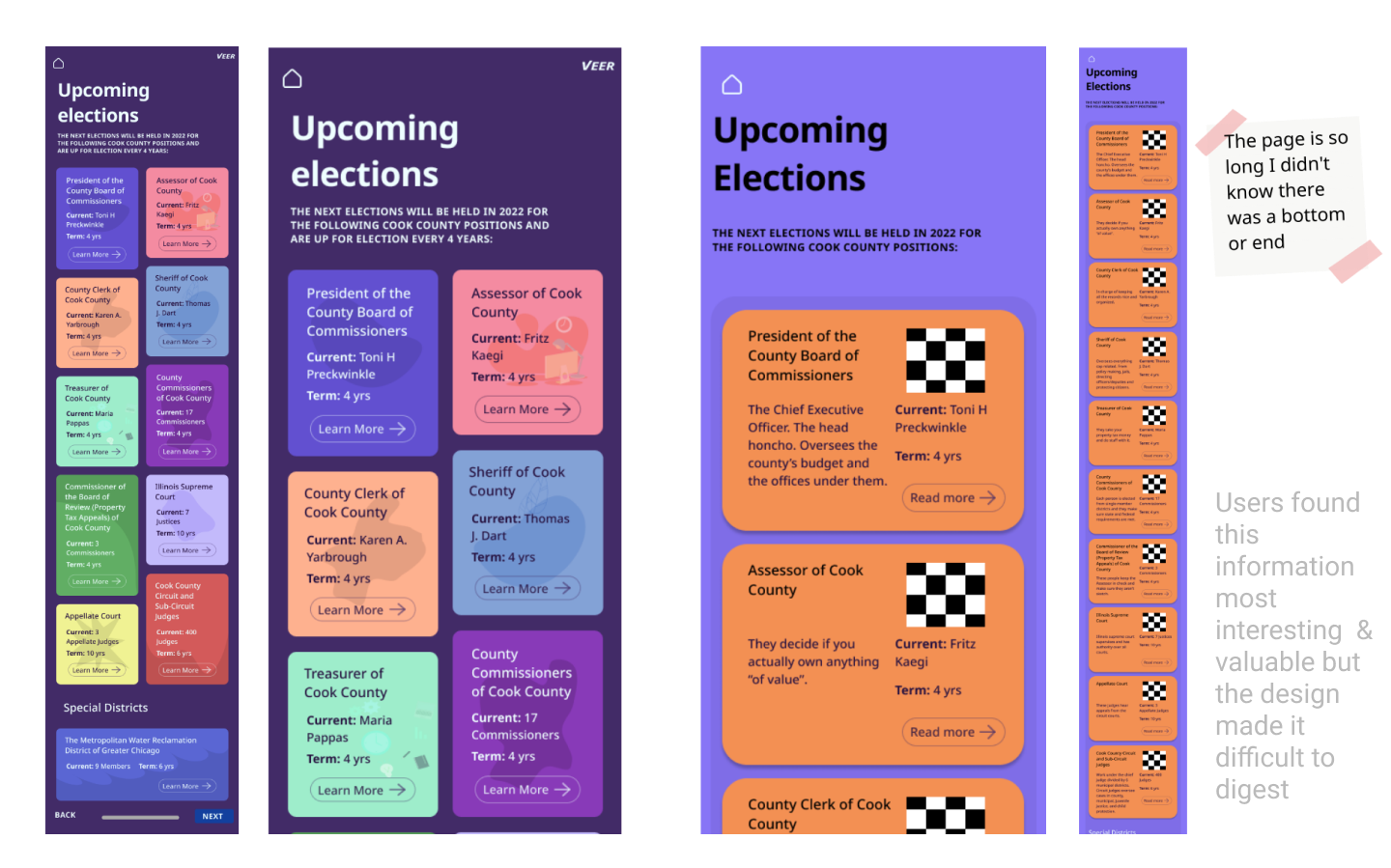
In the final 2 weeks, I synthesized user feedback and redesigned the entire user journey. I work well under pressure. The lead UX researcher, Beck, assisted with prototype animations.
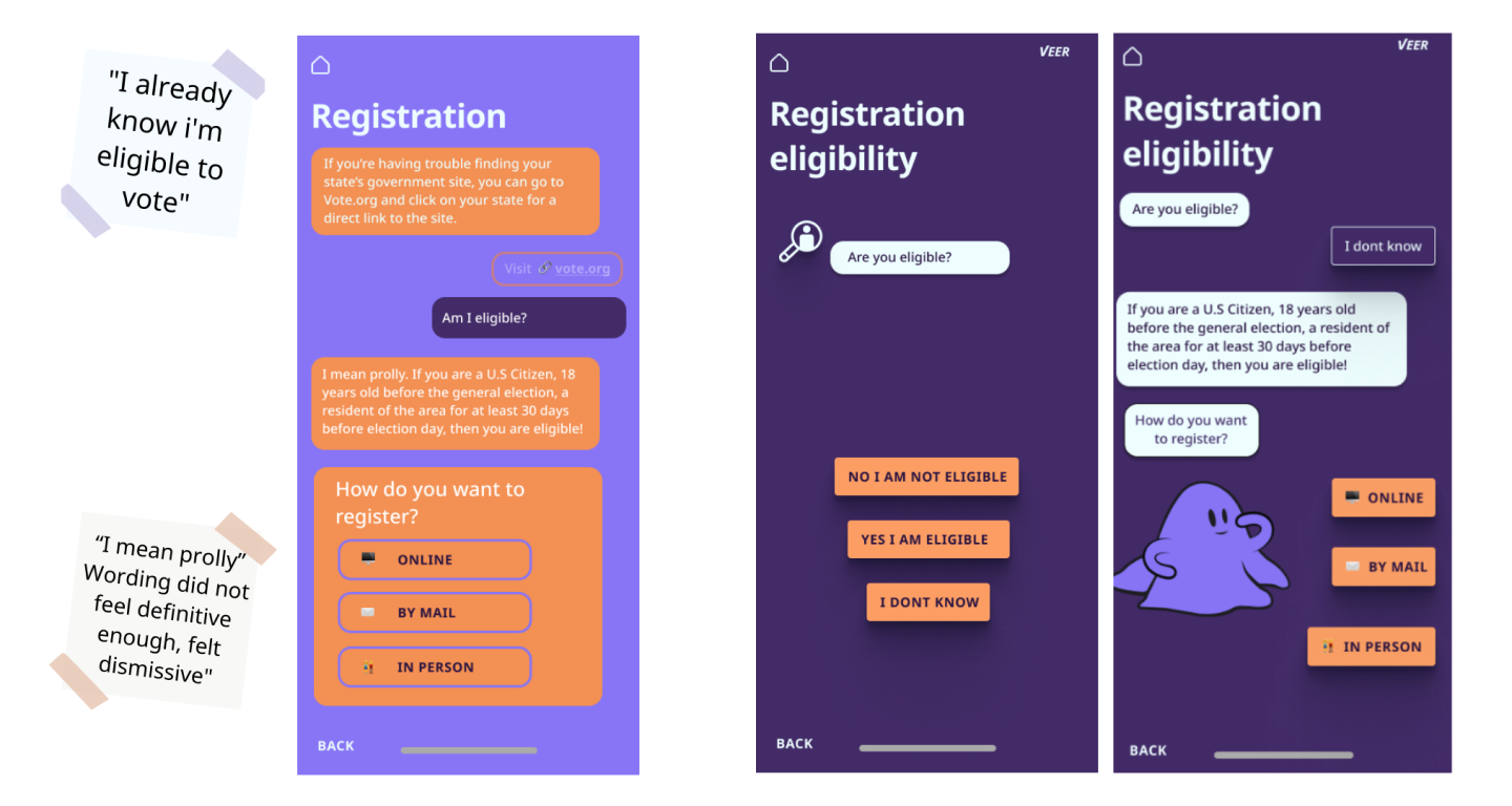
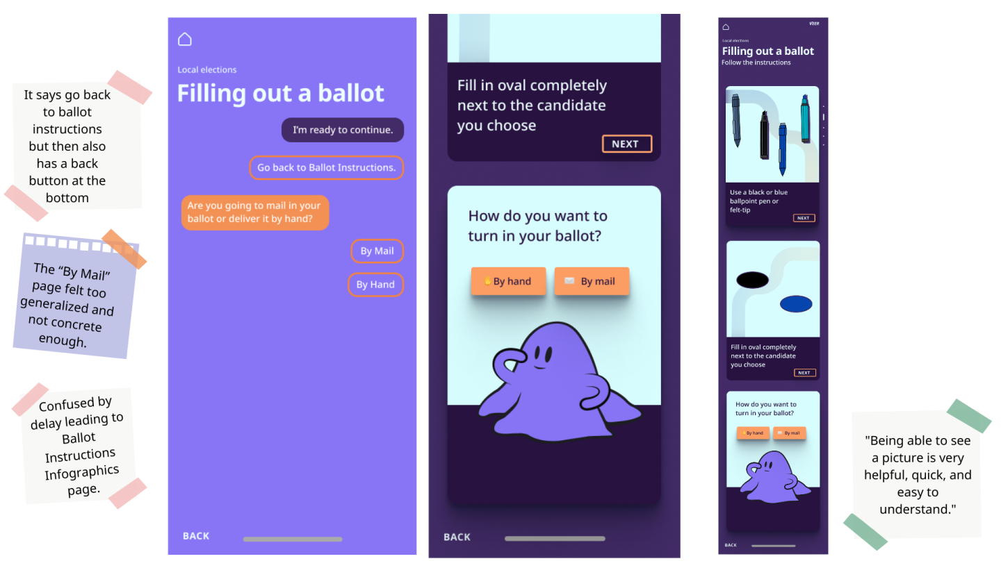
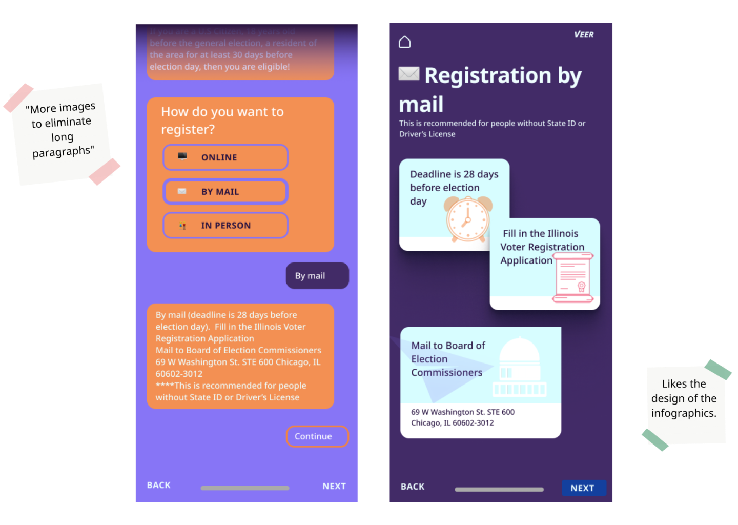
The implementation of SMS style communication with the user confused the user in this context. Casual language is OK between people because of the ability to ask "what do you mean".
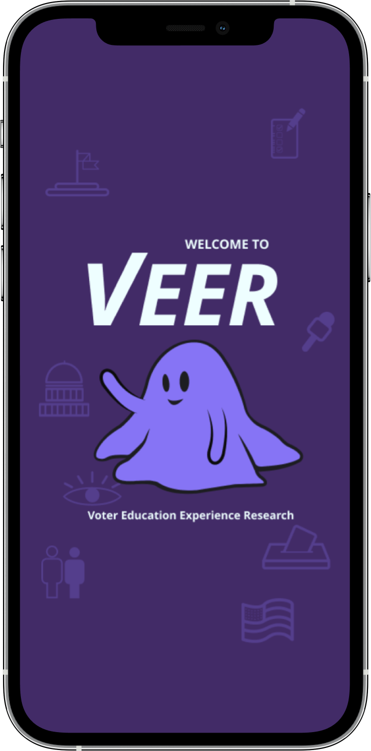
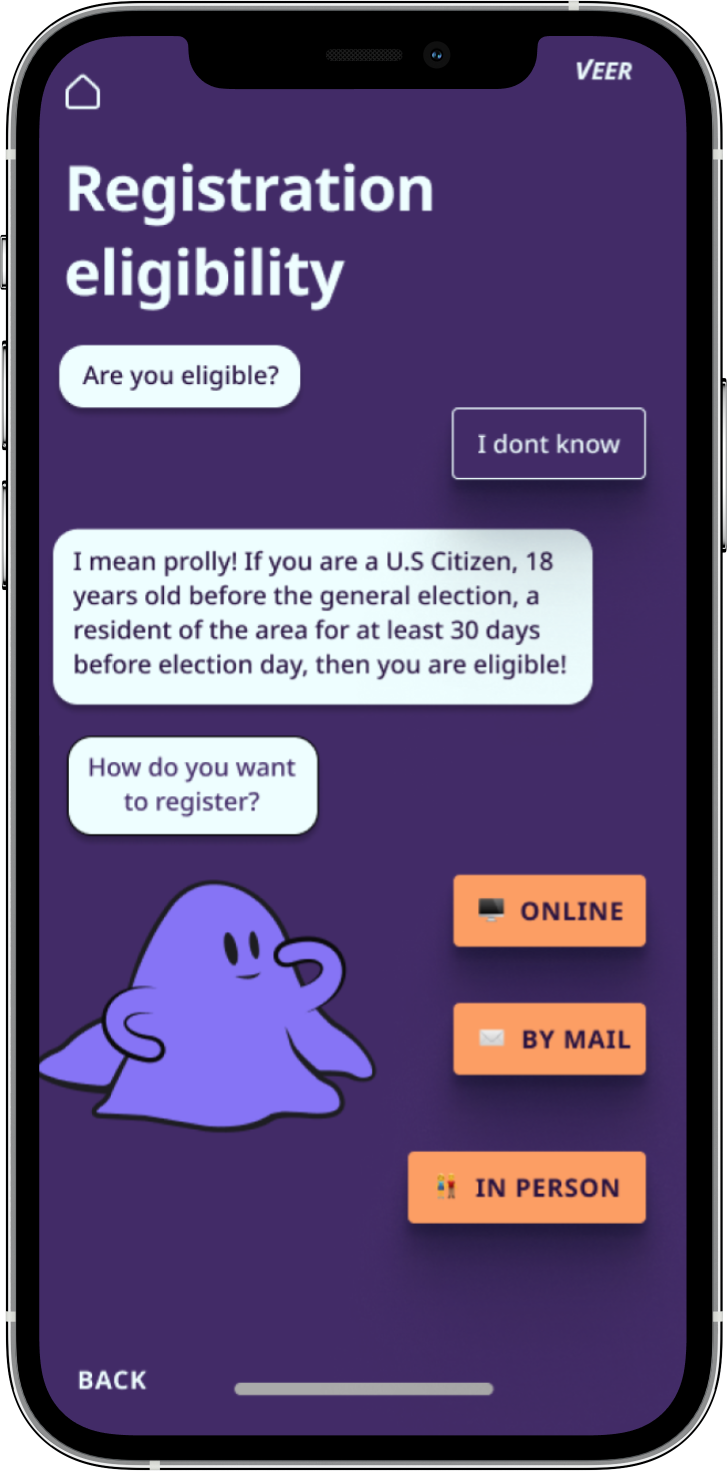
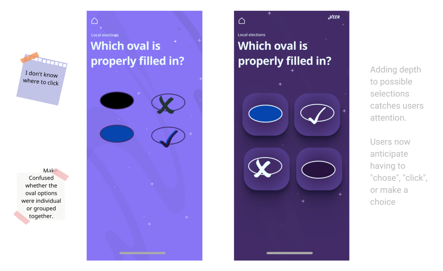
Why the blob?
Studies show the less characteristic a character is, the more identifiable it is universally.
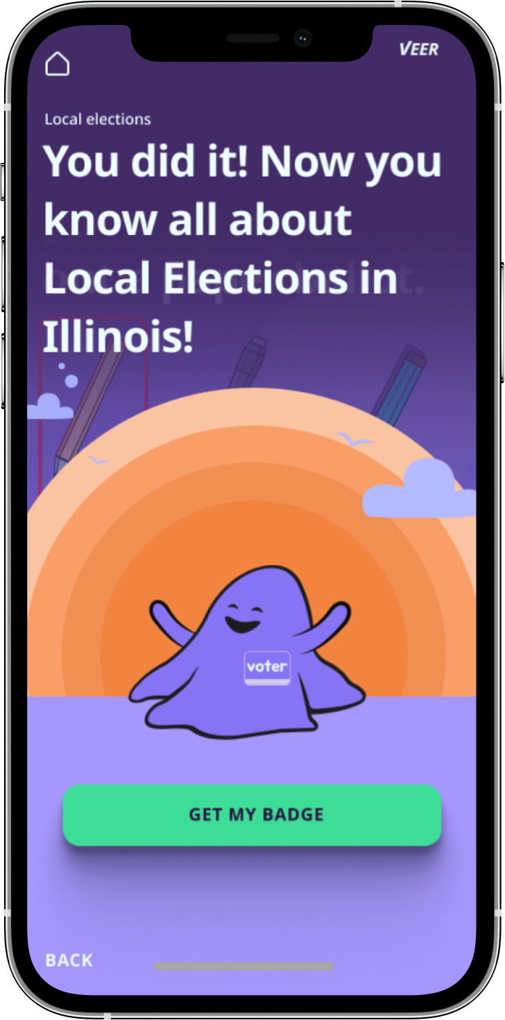
Final screens